New York Adventure Club (NYAC)
WEBSITE REDESIGN
OVERVIEW
New York Adventure Club is a community-driven club that curates the most unique experiences in town with a focus on history and storytelling.
MY ROLE / TIMELINE
Within a team of 3 UX Designers, I acted as Team Lead and Designer during the span of the 3-week project. Our team shared the responsibilities of Research and Design.
PROBLEM
How do we redesign the NYAC website to allow users to easily discover urban-exploration events, purchase tickets, and sign up for newsletter updates?
OPPORTUNITY
To purchase an event ticket, users had to jump between two main websites (New York Adventure Club, BigMaven). We intended to combine these two sites into one cohesive experience.
RESEARCH
PREVIOUS DESKTOP DESIGNS (click to enlarge)
CONTEXTUAL INQUIRY

We attended an Adventure Club event to collect information on existing site users that actively use the site.
Existing User Takeaways:
- Often skipped over existing NYAC landing page in favor of the BigMaven events page
- Liked the variety of events offered
- High engagement with event content
- Newsletter seen as vital resource
USER INTERVIEWS
We interviewed potential NYAC users, and synthesized the results through affinity mapping.
User Takeaways (potential users):
- Enjoy the social aspect while exploring the city
- May browse events on phone, but prefer to purchase tickets on desktop.
- Expect to gain necessary information at a glance
- Like email / newsletter updates

Affinity Map
PERSONA CREATION
Using our synthesized research results, we created two personas to guide our designs going forward.
CARD SORTING
To revise the site navigation and simplify how users browse events, we asked users to sort 30 preexisting NYAC event cards. We synthesized the resulting user-generated categories, and were able to create 7 revised event-specific navigational categories.
Revised Navigation:
- Tours
- Activities
- Hidden Spots
- Food
- Arts
- Historic Sites
- Social

Resulting site map (linear structure used for easy events browsing)
DESIGN
DESIGN STUDIO
Our team ran multiple rounds of design studios to rapidly generate design feature options.
Areas of focus:
- Powerful and intriguing landing page
- Clear navigation
- Intuitive and concise ticket purchase flow
MID-FIDELITY WIREFRAMES
Using the agreed-upon designs from design studio sketching, we brought the screens to mid-fidelity in Sketch.

Landing page

Event Categories page

Event Details page
Using the above wireframes, we conducted usability tests.
Key Findings:
- Placement of 'Sort By' button was found confusing
- Revised navigation was understood and readily used
- Revised event filters were clear and found useful for sorting through events
- The landing page was not found to be particularly exciting
HIGH-FIDELITY MOCKUPS: Landing Page
Based on user testing feedback, we went through multiple different landing page iterations in search of one that users found exciting, powerful, and comprehensible, while making only minor iterations to the events pages.
In testing the final landing page iteration (furthest to the right), we found the following:
- Landing page was 'delightful' and users were encouraged to explore further
- Users had an accurate idea of what site offered from the landing page alone
- Users wanted to explore offered events further
DEVELOPMENT
After we delivered the final prototype to our client, I helped to arrange a partnership with a developer in order to implement the website. The MVP site is currently live and is undergoing small changes as it grows and acquires new features.
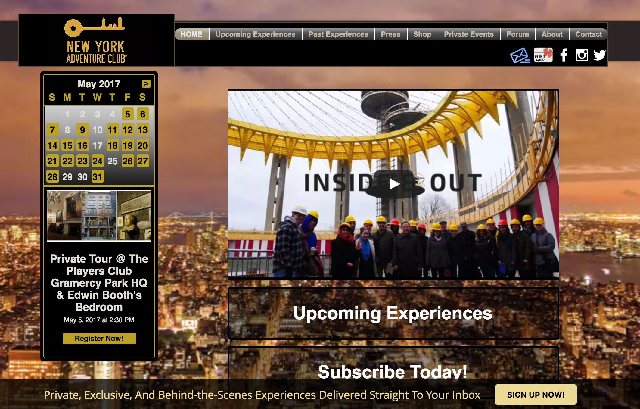
CURRENT WEBSITE
View Website


.png)
.png)